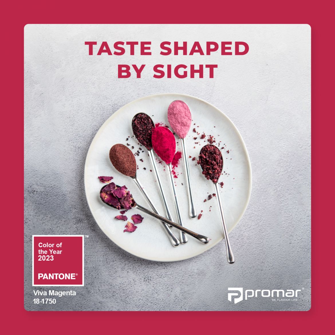
Bold, inspiring, unconventional, vibrating with positive energy and full of hope - this is the Colour of the Year 2023, chosen by the trend-setting Pantone Color Institute. The intense shade of Viva Magenta is becoming a visible trend in interior design, fashion and ... also on our plates!
It is a colour derived entirely from nature. As the Pantone Color Institute points out, Viva Magenta finds its organic origin in the insects that produce the carmine dye - several larvae of the bug species. This is one of the most valuable and powerful natural dyes known since ancient times. In many cultures it has been used to dye fabrics, decorate objects and paint pictures. Today, cochineal (E120) is used in the production of food, cosmetics and some pharmaceuticals.
The shade Viva Magenta is a colour perfectly suited to our times.
Its power and grace are designed to send us out into the world with longed-for verve and to aid in our healing. Viva Magenta provides confidence and motivation in the face of pandemics and war. Furthermore, it is a reflection of our collective need for strength. Reds are the colours of power and symbols of life. In a trend of pallor and neutrality, the use of the Colour of the Year 2023 will express an out-of-the-box view of the world. Furthermore, reds develop colour, attract the eye and provide distinction.
Viva Magenta - why opt for it in the kitchen?
It turns out that colours have a unique place in our diet and food preferences. Many articles and theories have been written about 'eating with your eyes', often backed up by research. The sense of sight plays an incredible role in choosing which food we buy and which we eat first from the table. Contrary to appearances, the sense of taste is not exactly the most important when eating. This begs the question: Does what we like taste better?
We use all of our senses to evaluate the taste of food. We use our eyes to register an image and transmit it to our brains. Based on previous experiences, we are able to verify the taste of a given food, its value and even its nutritional content. Colours allow us to compose dishes in any way we like: the ingredients can complement each other in a harmonious or perversely surprising way. In the kitchen, everyone becomes a virtuoso of the various dining sensations.
We pay attention to the aesthetics of the presentation:
- the colours on the plate (visual experience),
- the scent that stimulates the appetite (olfactory sensations),
- the texture on the tongue (tactile sensations),
- crunching (auditory sensations),
- and finally on the activation of the taste buds (gustatory sensations).
Neuromarketing has devoted its attention to the relevance of colours in choices. His research, which involved estimating how long people hesitate before expressing an opinion, showed that the colours of food packaging evoke positive, neutral or negative emotions. Warmer colours influence consumer engagement, feel natural, fresh and encourage people to eat the product.
Moreover, it is the colour red, according to an old evolutionary mechanism, that is considered valuable and nutritious.
PROMAR's wide range of marinades, sprinkles and crusts from the PROAROMA line also includes those in the shade of beautiful VIVA MAGENTA. Our products are mostly based on natural ingredients: fruit and vegetable extracts, flowers (such as the insane edible roses), as well as dried beetroot, sumac and different varieties of hot pepper.
Let our eyes do the work!
Feel free to contact us, we will be happy to provide you with details of our offer!


