For over 30 years, PROMAR has been seen as a reliable and trustworthy business partner, supplying solutions for the food industry domestically and abroad.
Over the span of three decades, PROMAR has increased its offer and evolved into an umbrella brand which has become synonymous with quality, engagement and flexibility.
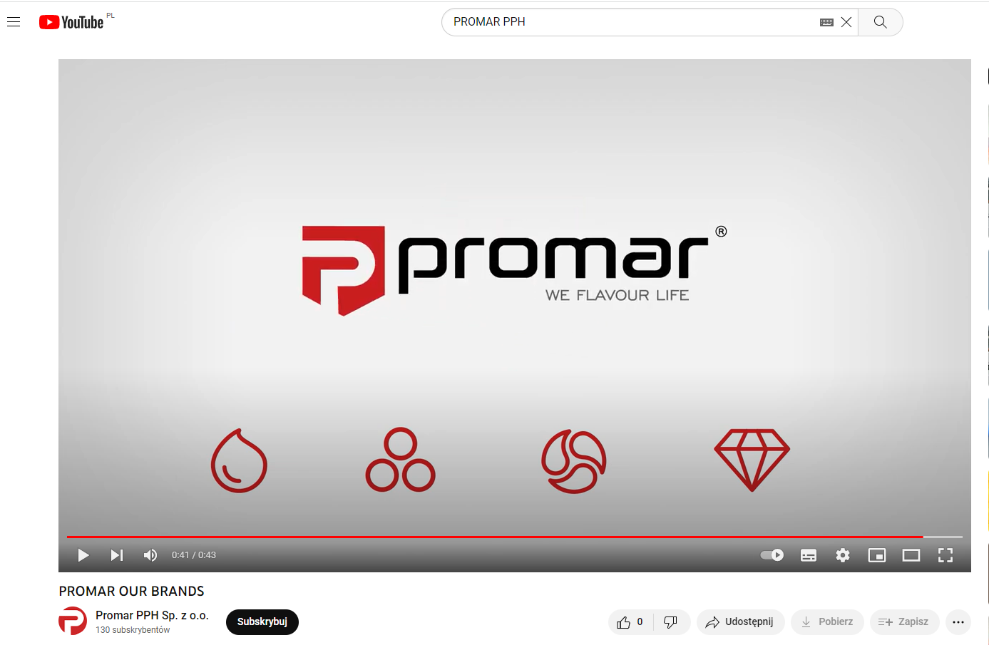
Currently, it has the following sub-brands under its wings: PROMASOL / PROAROMA / PROMIX / PROPURO,
each of the above brands is of key importance and strategically valuable for PROMAR, so it is especially important to keep visual consistency and transparency irrespective of the content or the medium. They have the most influence on the recognizability of the company. Following the needs of our business partners, constantly growing offer of the company, as well as current trends – we decided to refresh the visual identity of our brands.
The first thing to be changed was a color scheme. The number of colors used was reduced. We limited them to just red and black – like with the umbrella brand. Clear, bold colors invoke energy, passion, dynamism and the highest quality class. Individual signets have been simplified. The current signs include consistent contour symbols in red. Each name contains a “pro” prefix in black. The second part of each individual name is red.
The rebranding of our brands is a consistent and modern image, which still honors the history and traditions of the brand.
The following animation shows the results of our work on the new, consistent brand image.
udostępnij udostępnij


